The Ultimate Guide to Photo Paper Finishes and Their Impact on Image Quality
T.K. Broecker / 19 October 2025
Choosing the Right Photo Paper Finish: Bringing Your Images to Life
From digital capture to physical print, every decision affects how a photograph is ultimately experienced. Among these, photo paper selection stands out as one of the most critical. Each finish—whether glossy, metallic, lustre, or matte—imparts unique characteristics that can elevate or alter an image’s mood, depth, and visual impact. Understanding how each paper type performs allows photographers to align technical decisions with artistic intent. For a deeper understanding of how paper interacts with inks and light, see Hahnemühle’s guide to fine art papers .
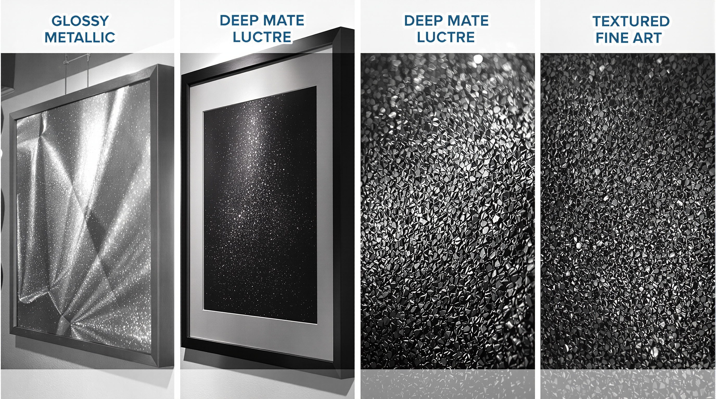
Understanding Lustre Photo Paper
Lustre photo paper serves as the perfect balance between glossy brilliance and matte subtlety. Its soft, pearl-like surface delivers rich color and refined texture—qualities that make it a favorite among portrait and wedding photographers.
Key Features of Lustre Finish
- Delicate texture reduces glare and fingerprints.
- Enhanced color saturation compared to matte papers.
- Professional, elegant appearance ideal for portraits and events.
- Durable surface resistant to light handling wear.
The slight sheen of lustre paper enhances depth and contrast without the mirror-like reflection of glossy prints. Its forgiving texture conceals small imperfections, making it a versatile, all-purpose option suited for both professional portfolios and everyday displays.
The Dramatic Impact of Metallic Photo Prints
Metallic photo paper transforms photographs into striking visual statements. Embedded metallic particles create a pearlescent finish that shifts dynamically with light, producing vibrant depth and dimensionality.
Distinctive Qualities of Metallic Prints
- Iridescent glow with luminous highlights and deep shadows.
- Exceptional Dmax for deep, rich blacks and striking contrast.
- Increased perceived sharpness and clarity.
- Spectacular vibrance for high-contrast and reflective subjects.
Metallic prints excel with dynamic imagery—cityscapes, automotive photography, night scenes, and reflective surfaces gain a three-dimensional presence unique to this medium. However, their bold appearance may overpower softer or vintage-style portraits, where subtler finishes better preserve mood and tone.
Exploring Deep Matte and Fine Art Papers
For photographers seeking elegance through restraint, deep matte and fine art papers deliver understated sophistication. These papers emphasize texture, depth, and tonal nuance over high saturation or contrast.
Defining Features
- Completely non-reflective surface eliminates glare.
- Velvety feel with soft tonal transitions and painterly depth.
- Warm, organic color rendition ideal for fine art and portraiture.
- Museum-grade longevity when paired with pigment inks.
Fine art papers elevate this concept further, incorporating cotton or alpha-cellulose fibers with distinctive textures—ranging from smooth matte to heavily embossed surfaces. Without optical brighteners, these papers exhibit warmer base tones that complement subtle, expressive imagery.
Classic stocks like Hahnemühle William Turner, German Etching, and Somerset Velvet enhance tonal richness and texture, making the paper itself part of the artistic experience—especially in monochrome prints where surface detail amplifies emotion and form.
Making the Right Choice: Glossy vs Matte and Beyond
The choice between glossy, matte, and specialty papers defines how an image communicates visually and emotionally. Each finish interacts differently with color, light, and texture.
Technical & Environmental Factors
- Color Depth (Dmax): Glossy and metallic offer deeper blacks and higher contrast.
- Display Environment: Matte excels in bright spaces; glossy performs best under controlled light.
- Archival Stability: Fine art papers with pigment inks offer 100+ year display life.
Aesthetic Considerations
- Glossy and metallic finishes emphasize contrast and color vibrancy.
- Matte and fine art papers highlight texture, subtlety, and tone.
- Subject matter should guide the choice—vivid landscapes thrive on glossy, portraits glow on matte.
No single paper finish is universally best. Instead, each image finds its ideal match through thoughtful experimentation. Many professionals maintain a curated selection of preferred papers—choosing the one that best complements the mood, tone, and intent of each photograph.
Conclusion: The Art of Choosing Your Paper
The surface of a photograph is its voice—it determines how light interacts with the image and how emotion is conveyed to the viewer. From the shimmer of metallic prints to the quiet elegance of fine art papers, each finish tells a different story. Exploring these materials isn’t just technical fine-tuning—it’s a creative dialogue between the artist and the medium.
Discover more insights and material comparisons on the Iris Pro Imaging blog , where professional printing and fine art craftsmanship meet.