The Ultimate Color Management Guide for Professional Photographers
T.K. Broecker / 26 October 2025
Mastering Color Management in Photography: From Screen to Print
Color management is one of the most vital yet often overlooked elements of professional photography. From image capture to on-screen editing and final print, maintaining accurate color throughout your workflow ensures that your creative intent is faithfully realized. This guide outlines the key components of a color-managed workflow—helping you achieve consistent, predictable, and accurate color across every stage of your process.
Understanding Color Spaces and ICC Profiles
At the heart of every color-managed system are color spaces and ICC profiles. A color space defines the range (gamut) of colors that can be represented, while an ICC profile acts as a translator between devices to ensure color consistency.
Common Color Spaces in Photography
- sRGB: Standard gamut ideal for web use and universal compatibility.
- Adobe RGB: Expanded gamut suited for print workflows.
- ProPhoto RGB: Extremely wide gamut encompassing nearly all visible colors.
- CMYK: Subtractive color model used in commercial and offset printing.
ICC profiles, standardized by the International Color Consortium, ensure consistency across devices by mapping each device’s color output to a common color space. When choosing a working color space, align it with your output goals—sRGB for digital display and Adobe RGB or ProPhoto RGB for print workflows where wider color representation is beneficial.
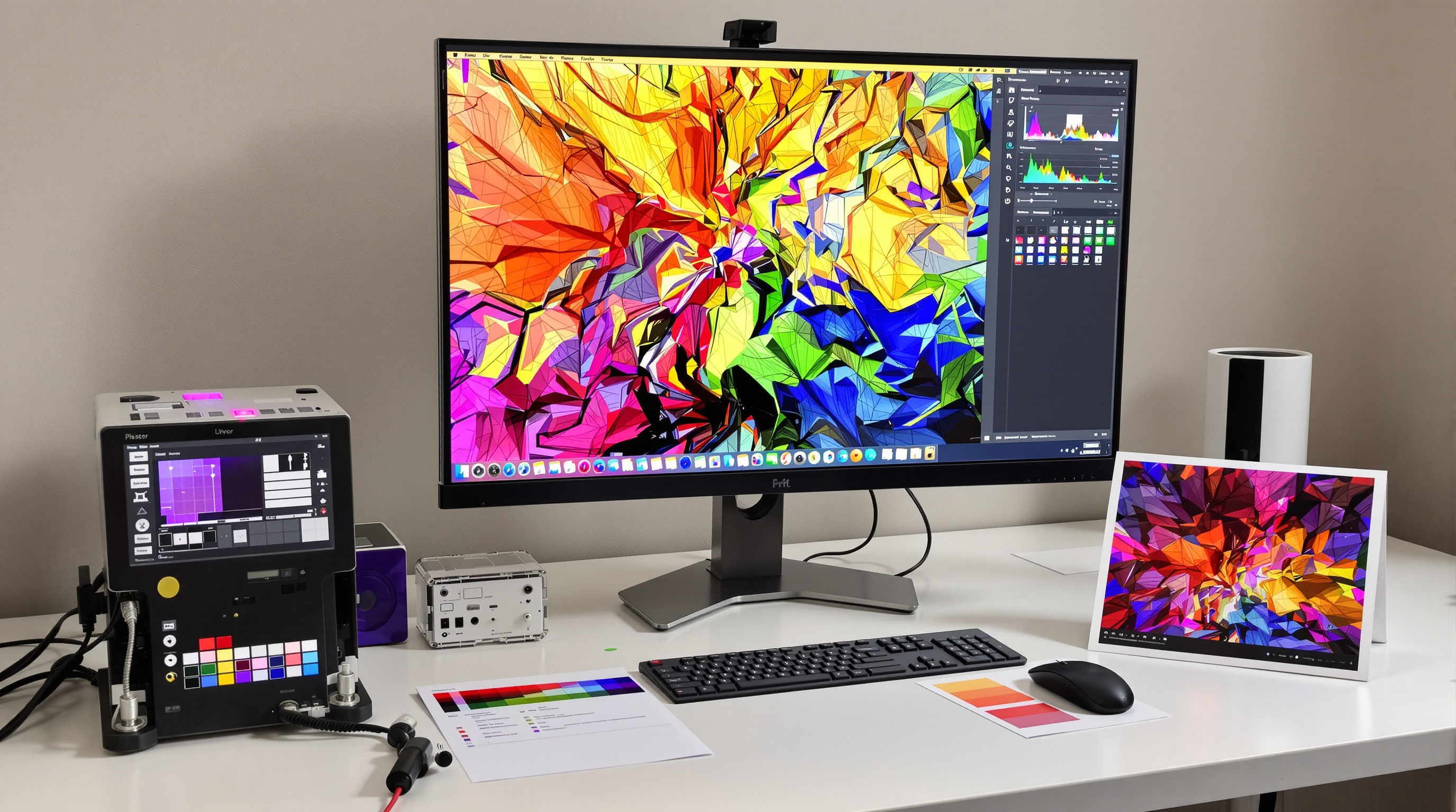
Monitor Calibration: The Critical First Step
Your monitor is your visual reference for editing, making calibration the foundation of accurate color management. Without it, you risk producing images that print or display inconsistently on other devices.
Essential Calibration Steps
- Use a colorimeter or spectrophotometer with professional calibration software.
- Set white point to D65 (6500K) and gamma to 2.2.
- Target monitor brightness between 120–140 cd/m² for editing or 80–100 cd/m² for print matching.
- Recalibrate monthly under consistent ambient lighting conditions.
Hardware-calibrated monitors are preferred for professional work—they adjust the display output directly, providing more reliable and stable color than software-based solutions.
RGB vs CMYK Workflow Considerations
Understanding the difference between RGB (additive) and CMYK (subtractive) color models is essential for achieving consistent results when transitioning from screen to print.
RGB Workflow Advantages
- Wider color gamut with more vibrant tones.
- Non-destructive editing flexibility.
- Ideal for photo printers that handle RGB-to-CMYK conversion internally.
CMYK Workflow Considerations
- Necessary for commercial offset printing.
- Reveals gamut limitations early in the process.
- Allows control over ink levels and black generation.
For most photographers, maintaining an RGB-based workflow with soft proofing for CMYK output strikes the ideal balance. Work in a wide-gamut RGB space during editing, then simulate print limitations using soft proofing to avoid unwanted surprises.
When preparing files for commercial printers, always confirm their preferred color profiles and submission requirements. Many modern labs now accept RGB files, performing the conversion using their calibrated workflows for maximum accuracy.
Soft Proofing in Lightroom and Print Testing
Soft proofing bridges the gap between digital and physical output by simulating how your image will appear when printed on a specific medium or device. Adobe Lightroom Classic offers a dedicated soft proofing feature for this purpose.
Steps for Soft Proofing in Lightroom Classic
- Enter the Develop module and enable Soft Proofing (press S).
- Select your target printer profile from the Profile menu.
- Choose a rendering intent (Perceptual or Relative Colorimetric).
- Enable Simulate Paper & Ink to preview tonal limitations.
Soft proofing helps identify out-of-gamut colors, allowing you to make precise corrections before printing. It’s a non-destructive process—edits can be applied to virtual copies created specifically for print.
Even with advanced proofing, physical test prints remain invaluable. Create standardized test sheets that include:
- Color and grayscale gradients
- Skin tones and high-detail sections
- Fine textures and shadow areas
Keep test prints and calibration notes as a reference library for future projects. Over time, this archive becomes an essential tool for maintaining consistent color output across all work.
Conclusion: Consistency Through Calibration
Color management is not just a technical discipline—it’s the foundation of creative integrity in professional photography. A well-calibrated workflow ensures that what you see is what you print, allowing your artistic vision to translate seamlessly across devices and media. By mastering calibration, understanding color spaces, applying soft proofing, and maintaining rigorous testing, photographers can eliminate guesswork, reduce waste, and deliver consistently stunning results—every time.