Mastering Color Management for Professional Photo Printing
T.K. Broecker / 22 February 2026
Color Management for Photographers: ICC Profiles, Soft Proofing, Calibration, & Color Spaces
In the world of professional photography, what you see should be what you get. Yet photographers frequently face the frustrating experience of prints that don't match their digital vision. Effective color management bridges this gap, ensuring consistency from camera to screen to final print. By mastering ICC profiles, soft proofing, monitor calibration, and color space selection, photographers can achieve predictable, accurate results that truly reflect their creative intent.
Understanding ICC Profiles for Accurate Photo Printing
ICC profiles are standardized data files that characterize a device's color reproduction capabilities. Created by the International Color Consortium, these profiles serve as translators between different devices in your workflow, ensuring consistent color interpretation.
What ICC Profiles Actually Do
Each device in your photography workflow—camera, monitor, printer—interprets and produces color differently. ICC profiles contain precise mathematical models that describe exactly how a specific device represents color, allowing your computer to compensate for these differences.
For photo printing, there are two critical profile types:
- Input profiles: Describe how your camera or scanner captures color
- Output profiles: Describe how your printer, with specific paper and ink combinations, reproduces color
Professional print labs like those in Louisville typically create custom output profiles for each printer-paper-ink combination they offer. Using these lab-provided profiles in your workflow dramatically improves print accuracy.
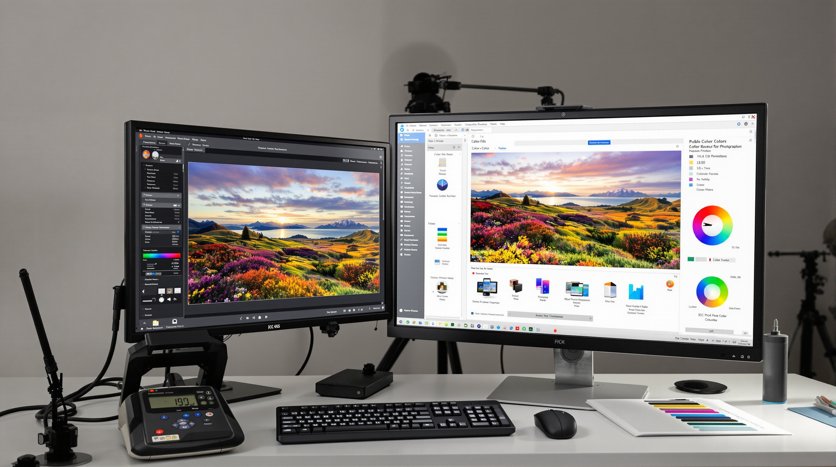
Soft Proofing Techniques for Print Prediction
Soft proofing is the digital simulation of how your image will appear when printed. This critical step saves both time and materials by identifying potential issues before committing to physical prints.
Effective Soft Proofing in Adobe Applications
In Photoshop, access soft proofing via View → Proof Setup → Custom. Select the output profile that matches your target printer and paper. Enable the "Simulate Paper Color" option to preview how the printer's white point and paper texture will affect your image.
In Lightroom, use the Soft Proofing panel in the Develop module. Toggle between your monitor view and the proof view to spot shifts in color and contrast that will occur in printing.
When soft proofing, pay special attention to:
- Colors that shift significantly between normal and proof views
- Shadow details that disappear due to the printer's limited dynamic range
- Bright, saturated colors that may appear dull in print
Monitor Calibration Essentials for Color Accuracy
Monitor calibration forms the foundation of a reliable color management workflow. Without a calibrated display, all subsequent color decisions become questionable.
Professional calibration requires a hardware device called a colorimeter or spectrophotometer. These devices measure your monitor's actual output and create a correction profile that compensates for its unique characteristics.
Key Calibration Settings for Photography
- White Point: D65 (6500K) is the standard for most photographic work
- Luminance: 80-120 cd/m² for editing in controlled lighting; lower (80-100 cd/m²) if you're comparing to prints
- Gamma: 2.2 for Windows and modern Mac systems
- Contrast Ratio: Native or maximum for your display type
- High-quality IPS monitors provide wider color gamuts and more consistent viewing angles than standard displays. For critical color work, consider monitors that cover at least 95% of Adobe RGB color space.
Color Space Selection and Render Intent for Optimal Printing
The color space you choose significantly impacts your printing results, particularly when working with professional labs like those in Louisville.
Adobe RGB vs. sRGB for Printing
Adobe RGB offers approximately 35% larger color gamut than sRGB, particularly in cyan-green hues. This makes it advantageous for nature, landscape, and underwater photography. Modern professional photo printers can reproduce most of the Adobe RGB gamut on high-quality papers.
However, sRGB remains the safer choice when:
- Using consumer-level print services
- Uncertain about a lab's color management practices
- Sharing images that will primarily be viewed digitally
Rendering Intent: Perceptual vs. Relative Colorimetric
Rendering intents determine how colors are adjusted when converting between color spaces with different gamuts:
- Perceptual: Compresses the entire color range to fit the destination gamut, preserving visual relationships between colors. Best for images with significant out-of-gamut colors, particularly photographs with vibrant, saturated areas.
- Relative Colorimetric: Preserves in-gamut colors exactly and clips out-of-gamut colors to the closest reproducible hue. Better for images where accurate color matching is critical, such as product photography.
For most photographic printing, perceptual intent produces more pleasing results, especially for landscapes and nature subjects with saturated colors. Portrait photographers often prefer relative colorimetric for its accuracy in skin tones.
Conclusion
Creating prints that perfectly match your vision requires a systematic approach to color management. By implementing calibrated monitors, appropriate ICC profiles, effective soft proofing, and informed color space choices, you can achieve remarkable consistency between screen and print. This comprehensive workflow eliminates the guesswork and disappointment often associated with photo printing, allowing your creative vision to translate faithfully from capture to final output. Professional labs, like those in Louisville, can become valuable partners in this process when you understand how to speak their color language.